Creating an Accessible Website for Europe’s Oldest Eye Hospital Charity: a Case Study [Mind the Product]

Working with a committed and hands-on client, plus a unique group of more than 200 testers, the team at design agency William Joseph created a new site for Moorfields Eye Charity where accessibility was key – and they delivered just in the nick of time.
Here, the agency’s UX and Content Strategy Manager Nicola O’Connor and Senior Designer Daniel Cullinan talk us through their process.
Overview
At William Joseph, a creative agency in London, our mission is to design products, services, and brands for organisations working for positive change, such as charities and academic and research institutions. In September 2019 we began a new project for Moorfields Eye Charity in London, a charity that funds research, education and care to make a difference to the lives of people with sight loss.
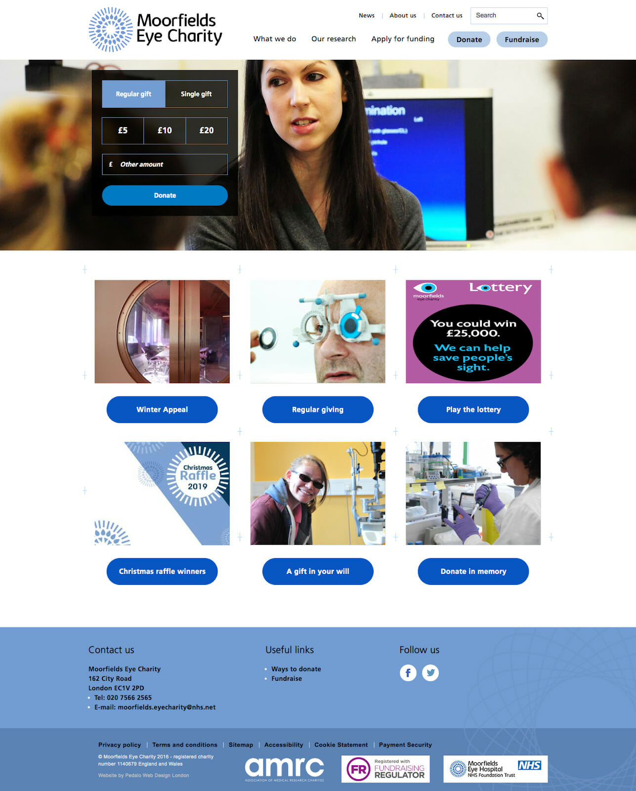
The project was to create a new site for the charity, to solve relatively straightforward problems. It wanted the ability to be more flexible with its content and to better meet the needs of its audience who look to donate, fundraise and find information. It had also recently undergone a brand refresh and so wanted this to be reflected on the new site.
The Approach
As with all our projects, we began with trying to understand the users, their primary goals, and what content they needed to achieve those goals. We used analytics to understand user behaviour on the existing site and even browsed social media channels to investigate the types of questions people in the audience might have when searching Google or talking to their friends on Facebook.
This process enabled us to create broad user journeys and helped us to learn more about the patients and families that Moorfields supports. We were also able to identify content opportunities that would help to differentiate the new site from other information sources.
We also started to build a new information architecture, considering how we might improve the site for new and existing users while continuing our regular discussions with stakeholders to ensure they knew why we were proposing a different structure.

We kicked off these conversations with a focus on page templates, encouraging people to be comfortable with new layout features such as single-columns and shorter line length. Initially, new white space in areas that might previously have been packed with content became a talking point. We find that there’s often a desire to fill white space and to stretch content across a screen but we thought it was important to encourage people to think from the small screen up, and to back up these decisions from an accessibility point of view, using feedback from testers as evidence. Fortunately, we had this in abundance!
Testing
Moorfields did an amazing job of getting groups of people to test for us. We ended up with more than 200 testers, split into different groups.
Our testers had a range of visual impairments and they used a variety of specific combinations of tools and tech to access digital content. This was very important because when it comes to accessibility, there’s no one size fits all. People get very attached to the tech and the browsers they use, and so, while you might fix things at your end, or for one combination of assistive technology, there will be many more you also need to consider. With that in mind, having so many testers with such a range of needs and technology was extremely helpful.
We did remote card sorts in the first two rounds of testing. The third round involved remote usability testing where we asked our testers to complete a task with very rudimentary information architecture. We asked them to find information, and then tell us where they would go on the site to find it. At this stage, they had no content on the page, just the navigation labels to orientate themselves, which is quite a harsh (but great!) test of the labels. This was followed by two further rounds of in-person testing with our prototype and finally the built site.
Each round of testing received a very good response rate, which meant we could be confident in our recommendations to stakeholders on how the structure of the information architecture, and what content people were looking for.
Tests identified a range of problems, including:
- General access: Logging in to NHS public wifi was challenging as it didn’t work with most screen reader technology
- Readability: The use of complex language, long sentences and paragraphs make reading more difficult for those with visual impairments
- Design: When users read pure black text on white backgrounds for an extended period of time it caused discomfort and eye strain
The Design Process
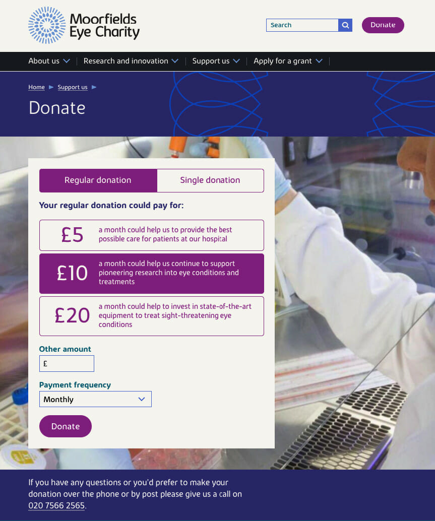
The colours and font had already been chosen with accessibility in mind during the charity’s recent rebrand, but, as a standard practice, we rechecked the colours to ensure they’d be ok, giving special consideration to the site’s visually impaired users.
We ran a detailed comparison of all the colours in the brand palette to find the best combinations. While WCAG permits a 3 to 1 ratio for text larger than 18 pixels, on this project we were looking to always achieve a minimum of 4.5 to 1 (AAA rating). We also ran the same colour comparisons through colour-blindness simulators for protanopia and deuteranopia (red-green) and tritanopia (yellow-blue).

We created a library of bullet points, paragraphs, and pictures that were then applied to an early example page for the client to view, along with some bespoke content so they could get a feel for the elements in context.
From there, we honed in on a couple of template types that would end up doing the heavy lifting for the client – for example, a typical research project page on a particular eye condition where the call to action would be to donate.

We picked apart existing messaging and then put it back together in a way that showcased all of the design elements. We then created content journeys to test those designs and developed the elements for different templates.
The Results
The Moorfields team wanted to enhance its digital presence so that users could more easily interact with the site. This included the ability to make donations, to fundraise, to book events, access information, and to get in touch. They also wanted more flexibility and to be able to update the site regularly.

We were able to meet accessibility requirements by working with what the Moorfields team already had. And we did it just in the nick of time, finalising work in February, just as the COVID-19 crisis began to build. As a charity that is part of one of the oldest hospitals in the heart of London, the team has since needed to update the site’s content much more rapidly and to support pandemic efforts through fundraising initiatives like its Coronavirus emergency appeal. It was great to be able to finish the work in time for it to be used during such a crucial period.
Conclusion
This project was supported so much by the team at Moorfields and the testers who helped us to build the right product. Yes, there were some challenges, such as ensuring code worked properly with screen readers, but ultimately, the work was straightforward and there are elements from this project that our whole team will take on to all future projects.
Building for accessibility is something we always strive to do, it’s like a call to arms – we should all be doing it. The key is to make it simple. Watching our testers during this project put this into very sharp focus.
So, if you’re unsure about accessibility or have no idea where to start, think simple. Cut the fluff, and all the stuff that you think is important, and focus on what people need to know. Those are the things that will benefit everybody.
The post Creating an Accessible Website for Europe’s Oldest Eye Hospital Charity: a Case Study appeared first on Mind the Product.
Source: Mind the Product https://www.mindtheproduct.com/creating-an-accessible-website-for-europes-oldest-eye-hospital-charity-a-case-study/


Post a Comment