How Uniregistry Used Smoke Testing in Product Validation: A Case Study [Mind the Product]

It’s said that more than two-thirds of software projects fail to deliver expected results. As a result, the team at Uniregistry decided to take a new approach to product validation in an attempt to avoid the same fate. Here’s how they used smoke tests to explore a new opportunity.
Overview
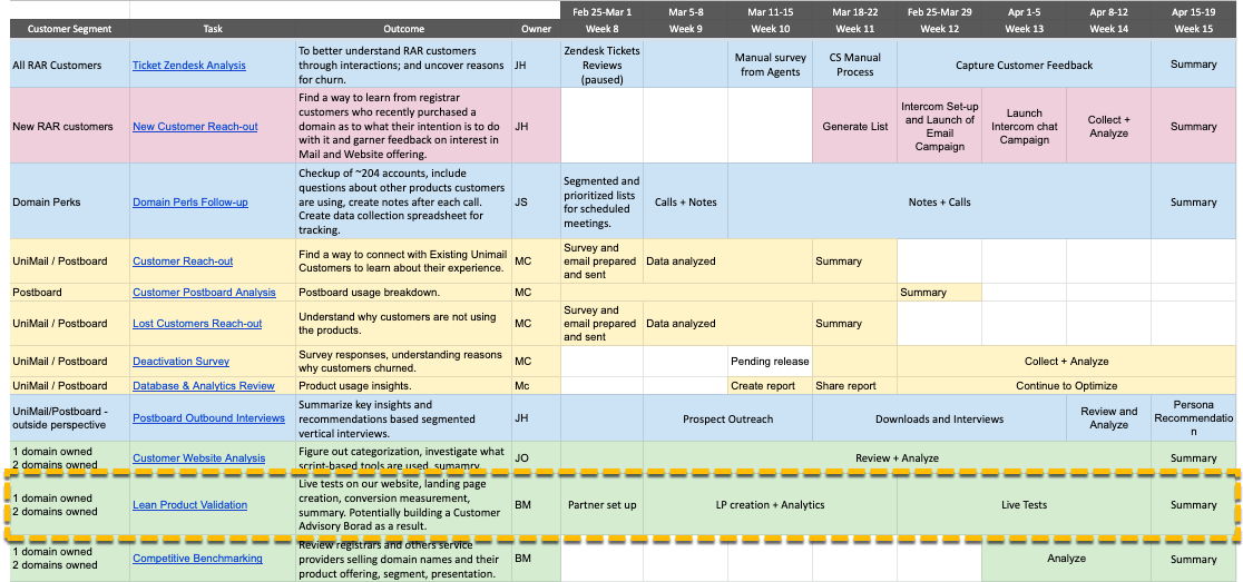
This case study describes a part of a larger product discovery project that I led as a product manager at Uniregistry, a platform that enables easy buying and management of domains and complementary products (online presence, business apps). The company’s products are used by 30,000 customers with over a million domains under our management. The company started as a domain registrar targeting independent entrepreneurs around the world and domain investors who demanded advanced tools to manage hundreds (and sometimes hundreds of thousands) of domains. Recently we’ve seen a new trend – that more of our customers use just a single domain and are freelancers, small or micro businesses. We decided to explore this new opportunity to grow our business beyond its core offering and to refresh our understanding of all customer segments. This case study focuses on Lean Product Validation, but the chart below gives an overview of our entire customer discovery process and the steps we followed.
The Approach
It’s because so many software projects fail to deliver expected results, that we d ecided to go with smoke tests. These serve not only a useful research tool to enable us to learn more about our new customer segment, but also provide us with the knowledge about which product could be most successful commercially.
We chose three product ideas:
- One Page Website
- Advanced Website Builder
- Web Performance Analytics
Each of these ideas was at a different stage of development. One Page Website functioned as a free feature of the Uniregistry mobile app and was deeply hidden in it. Advanced Website Builder was a white-label third-party solution that we could potentially integrate with. Web Performance Analytics was an early startup idea from the pitch deck of a partner company specializing in SEO.
We decided to launch landing pages for every product focused around a strong call-to-action, “Get Started Today”, then to bring quality traffic to the pages and monitor how they perform. Behind the scenes, none of the products existed.
It was important for us to create the impression that all the products were available to purchase.
We wanted to compare conversion funnels against the three products (between a product page and the first step of a shopping cart, and between the first and last steps of the cart). Equipped with such knowledge we could conclude which products would have greater sales potential, perhaps even greater than the products we were already offering. We would then be able to estimate the expected revenue for each product (monthly, yearly).
We ran the tests on paying customers. The biggest challenge internally was to educate customer-facing teams that our brand reputation will not be damaged if the products weren’t available to purchase. The project was also given the nickname – Uni, and a visual identity, shown below.
Giving the project such a name was intended to arouse interest inside the company, to encourage conversation and increase the chance that the learnings from the project would spread quickly through the company.
Every month, approximately 1,500 customers make at least one paid transaction on our site.
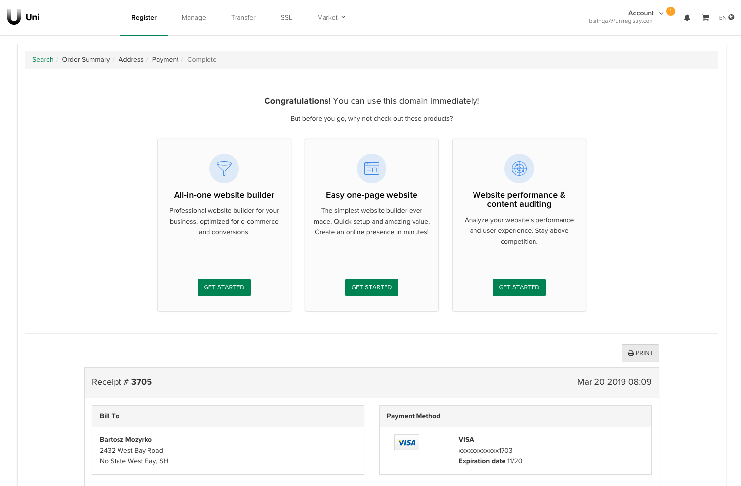
We wanted to redirect some of that high-quality traffic to our dummy pages. The last domain purchase step (Purchase Complete) was modified for the duration of the project to show three new call-to-action elements displayed in random order to each user.
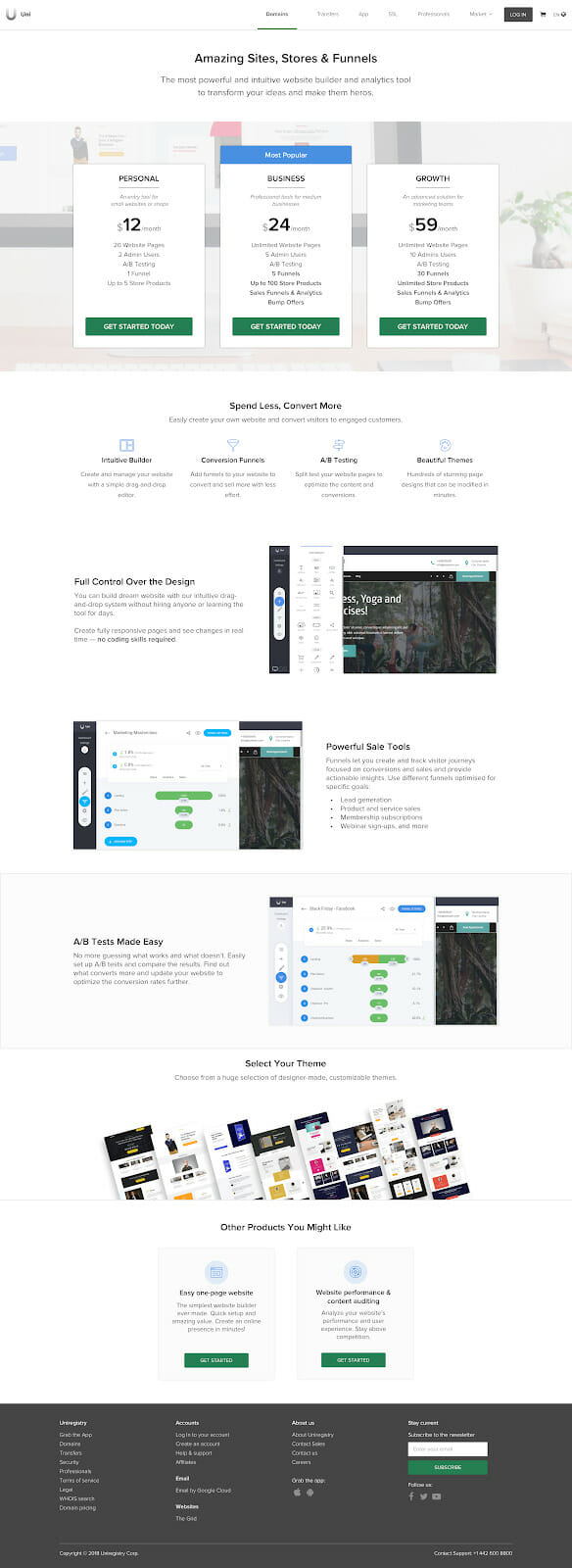
Each product page provided clear descriptions of value-adds but also enabled an easy way to explore two other products being tested (“Other Products You May Like”).
From the product page, customers were redirected to a modified version of our shopping cart. We monitored how many people progressed further, and also tested conversion on yearly plans with a discount.

For the next step, we provided a fairly general explanation of why the product was unavailable, and we also asked users to leave their contact details. Reaching this screen was considered a high-quality conversion and flagged as likely sale.
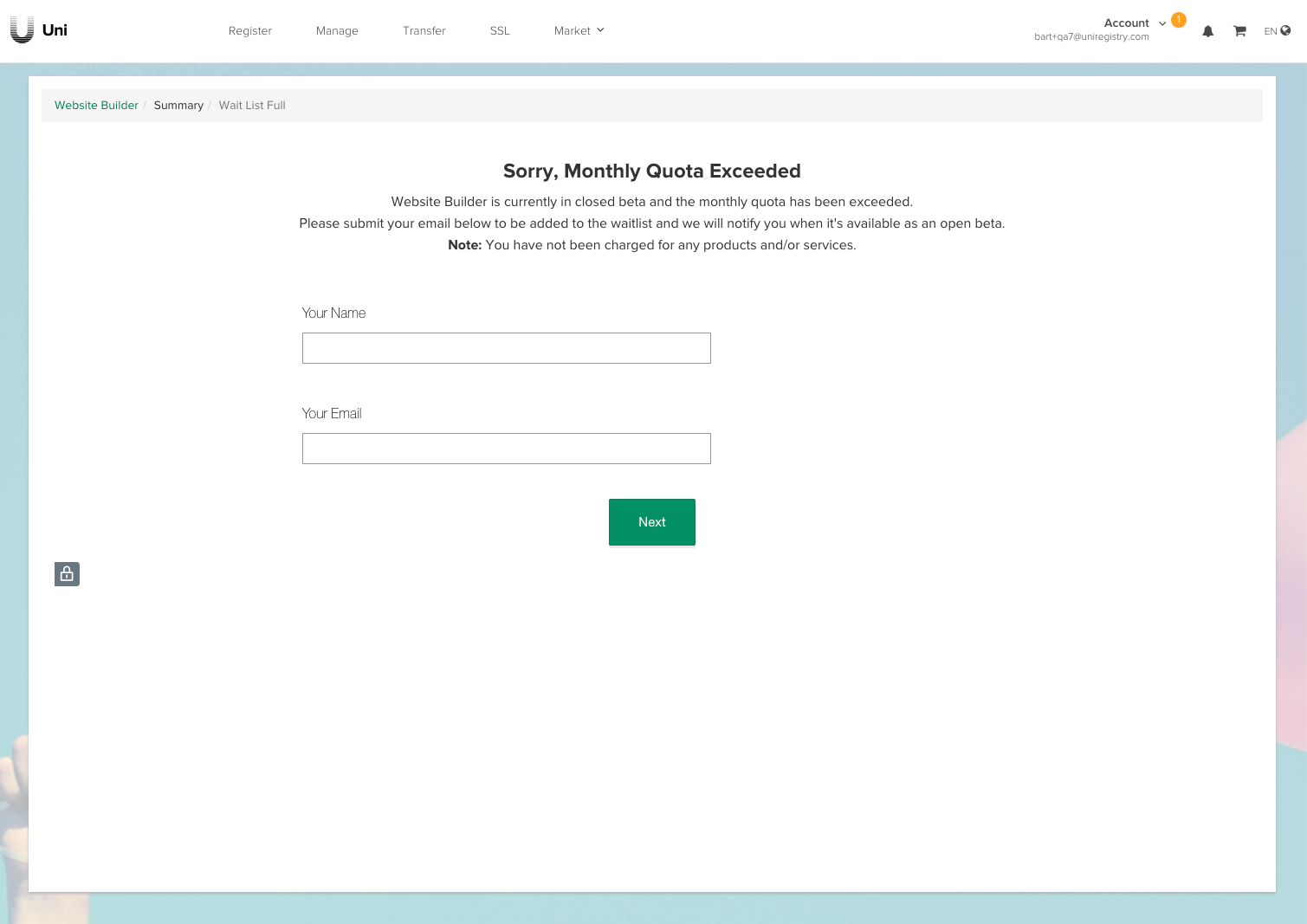
Our customer success team feared a flood of questions and complaints from dissatisfied customers due to this screen. Fortunately, we didn’t get any complaints during the project.
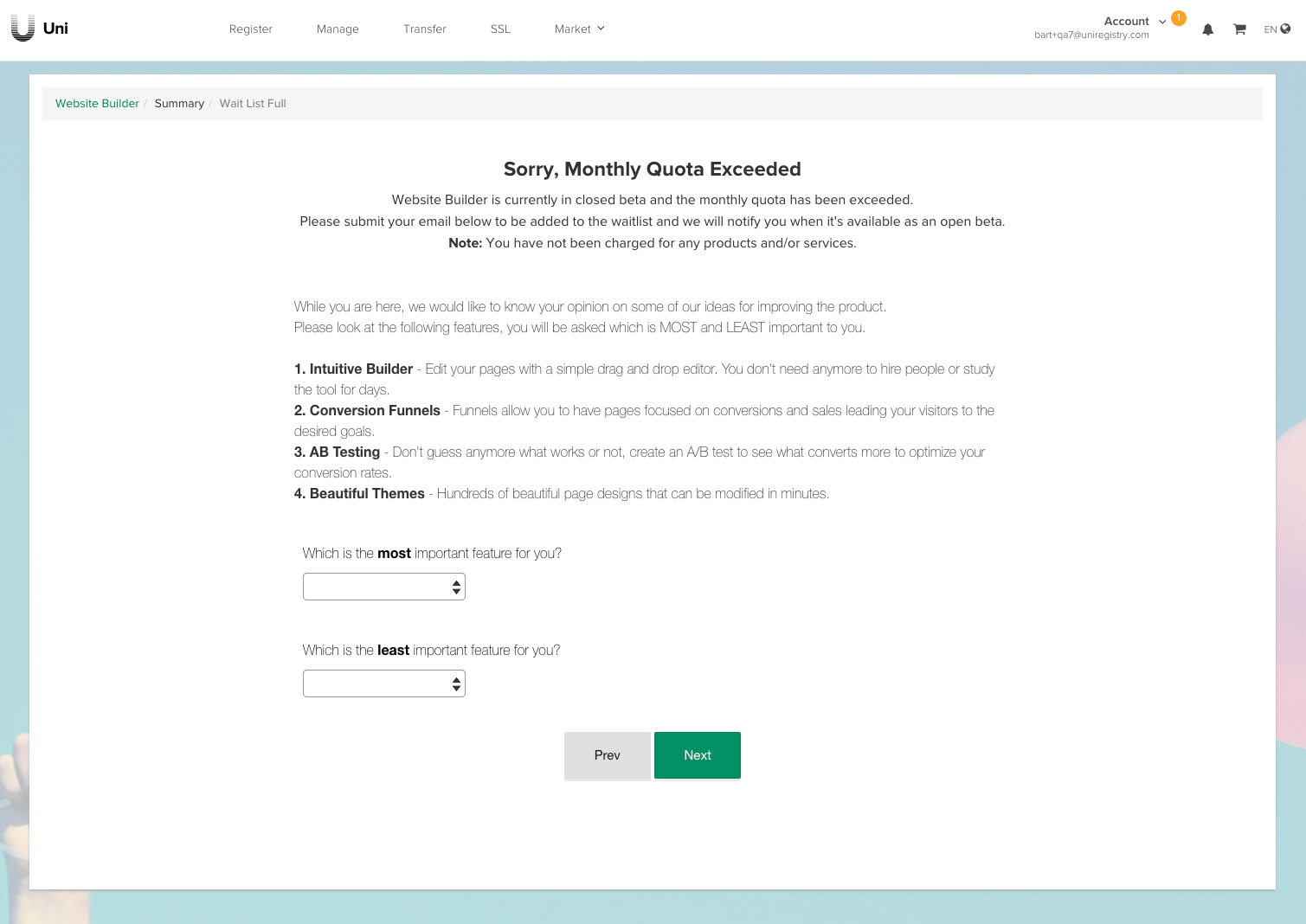
Then, we displayed a price sensitivity survey that allowed us to understand which aspects of the product’s value proposition were relevant to the customer. We knew that at this stage very few people would leave us additional information, but even a few answers would be enough to detect trends in preferences. We used an integration with SurveyMonkey to implement it quickly and cost-effectively.
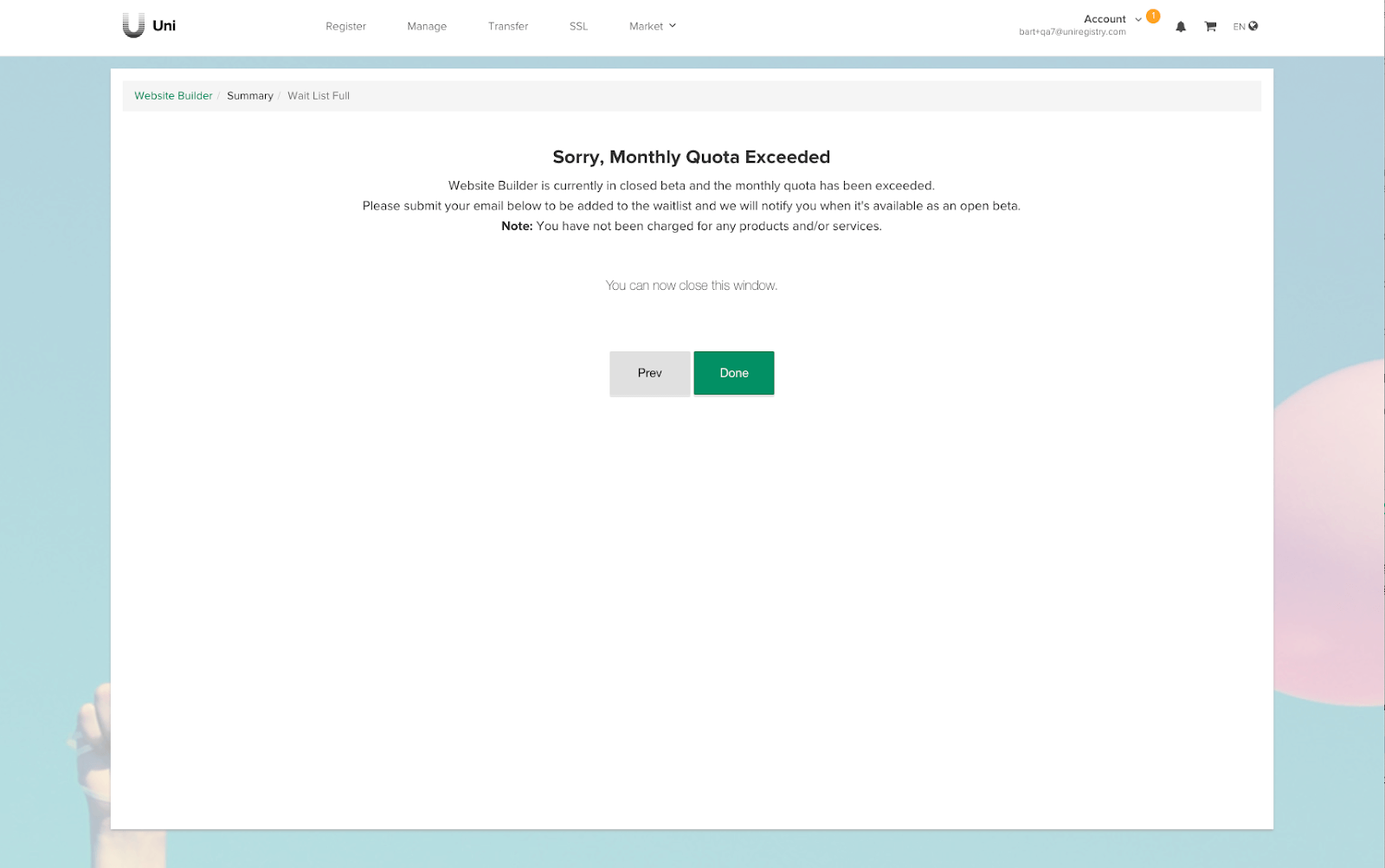
At the last step, we thanked the user and displayed information to close the browser window.
The Results
We used Woopra as the main analytical tool in our tests. We could see how far in the conversion funnel each segment went, where users stopped, how much time was spent on individual interactions and when users decided to abandon the process.
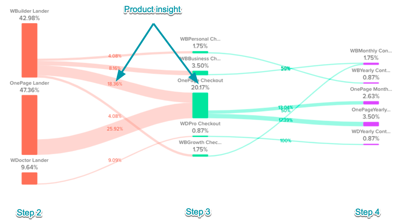
Two products generated considerable interest:
- 47.36% – One Page Website (OnePage Lander)
- 42.98% – Advanced Website Builder (WBuilder Lander)
Web Performance Analytics (WDoctor Lander) did not seem appealing to our customers.
Half of the users who chose the Advanced Website Builder on step 2 (product page) decided to explore the offering further and ended up on the One Page Website product page and a significant number of these users decided to purchase it. It was a valuable product insight.
Interestingly, some of the users committed to purchasing Advanced Website Builder with annual plans for hundreds of dollars before even seeing the product. This was a nice surprise for the team (the pages were convincing) but also helped us estimate better potential revenue for such a product line.
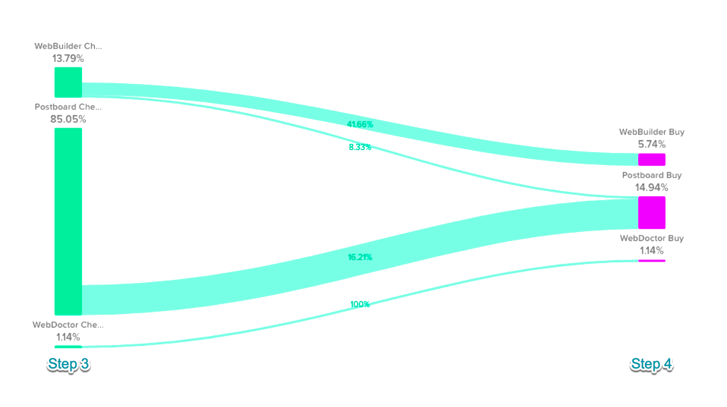
85% of users interested in buying any product (Step 3) were interested in the One Page Website (OnePage Lander).
Using the Tradeoff Feature Analysis approach, helped to clarify which features were most valuable to our users and why.
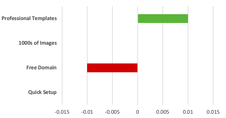
The team and stakeholders were happy with all the collected data and product insights.
After customer discovery, we conducted internal workshops with the COO, head of customer success, head of design, product marketing, account management and created a matrix of strengths and weaknesses for various scenarios.
We considered focusing on two groups of customers: companies employing between one and five people or companies employing more than five people. This difference, although seemingly small, had significant implications for our company, both in terms of product development, strategic positioning, and marketing activities.
We took into account criteria such as market size, entry barriers, profitability, competitive environment, customer acquisition costs, product stickiness, and various internal features of our organization. We needed to agree with the direction we were going in and to make sure that everyone understood the arguments behind the decision that was eventually made (which is not synonymous with “agreeing” with them).
Conclusion
The knowledge from the discovery process helped to make a decision in allocating company resources to advance the One Page Website to an independent product. The product has been released and sales are much as we had estimated during the discovery phase.
Although the results from our discovery project were encouraging, the launch of the new product won’t guarantee its success. The validation process was just the beginning, as the product now transitions from an introductory stage to the growth stage. The goal of our team will be to enable more entrepreneurs an easier way to start and manage their online presence to grow their business.
However, by going through the whole product discovery process we are in a much better position. After rolling-out the One Page Website, the next steps are to back it up with more research to uncover how the solution could solve the customer pains better and optimize for stronger product stickiness (customer retention) together with rolling out more advanced value-adds (pricing plan optimization).
I hope that the described case study will help you carry out effective tests, facilitate decision making and increase your product’s chance of success – good luck!
The post How Uniregistry Used Smoke Testing in Product Validation: A Case Study appeared first on Mind the Product.
Source: Mind the Product https://www.mindtheproduct.com/how-uniregistry-used-smoke-testing-in-product-validation-a-case-study/


Post a Comment