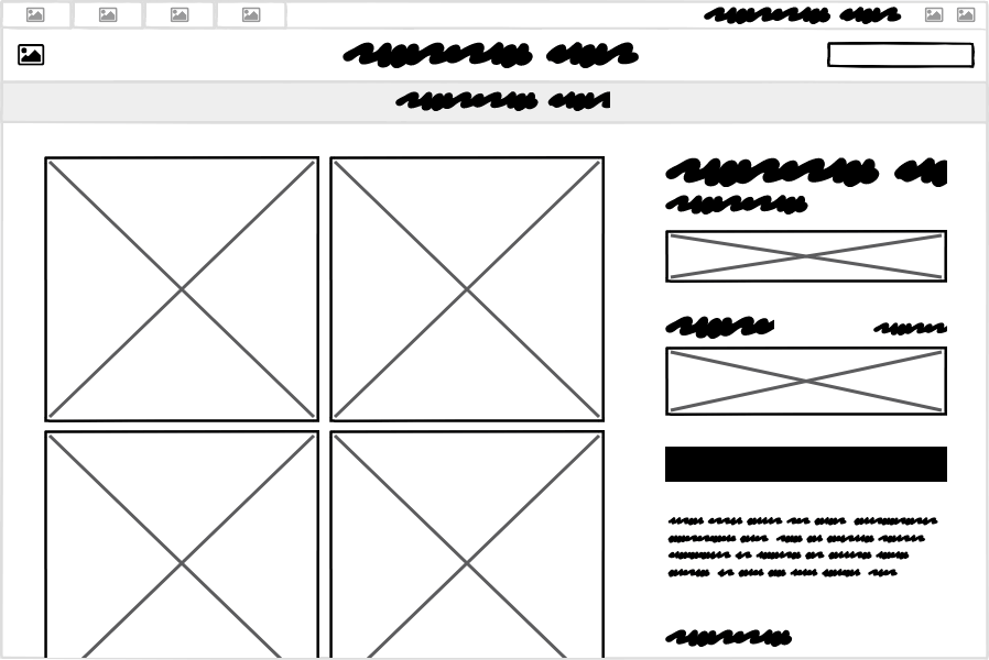
Wireframes Aren’t Just for Designers [Mind the Product]

Wireframes are often underused in the product development process but, as I’ll explain in this post, they can be invaluable in facilitating communication and knowledge transfer.
Using pen and paper to sketch out concepts and designs for software began with the birth of the graphical user interface (GUI) in the 1980s. It was a simple yet powerful technique used by visionaries, makers, and salespeople to communicate ideas for products and features that didn’t yet exist.
But over time, as digital user interface design tools have proliferated and grown in complexity, UI design has become the realm of dedicated designers, often taking away the ability of big thinkers and product people to show their own ideas. Yet one of the early digital design techniques, user interface wireframes, persist because they can be created (and understood) by anyone.

Wireframes as a Tool for Product Managers
The purpose of wireframing is not to draw a picture of a user interface for its own sake. Wireframing is not so much a technique for creating as it is for translating requirements and ideas into a visual language that can be easily understood. This translation role, conveying and explaining the needs of the customer to a software team, is a big chunk of what product managers do.
Let’s look at two specific ways that wireframes can help product managers perform this role more effectively.
Wireframes as a Communication Tool
You’ve probably heard stories of successful product ideas that began with a proverbial sketch on a napkin. The spark that happens there is ignited when communication happens between the right people, such as an idea transferred from thinker to builder or introduced by innovator to connector.
We are often told that the best way to communicate is to show instead of tell. Or that a picture is worth a thousand words. The instant “Oh, I get it now” reaction that wireframes can produce is the best reason for product managers, who may rely heavily on written and spoken communication, to use them.
Wireframes are the solution to the problem of developers not reading giant functional specification documents or zoning out during sales and marketing meetings. It’s a concrete way to get the same picture in everyone’s mind.
Wireframes as a Thinking Tool
Once you start to see wireframes as a communication tool more than a design tool, it can be easy to see them as only that. But why, then, do they generally look rough and unfinished? Wouldn’t it be better to present design proposals that look like the final product you want to create?
Going back to the idea of drawing on paper, think about a notebook or sketchbook that someone carries with them at all times. This conjures up visions of the owner jotting down notes or quick chicken scratches at times that would otherwise be inopportune – waiting in line, riding on the train, walking up stairs. Putting the pen to paper reifies the thought and then creates a jumping off point to continue it.
The rough nature of wireframes has a similar effect. Working with a tool that evokes sketching on paper encourages exploration and open-endedness. How often do you have an incomplete thought that you don’t want to lose? Simply making visible the seed of an idea helps you see the next step. Wireframes are a tool for capturing incomplete thoughts as well as for feeding them.
Wireframes can encourage product managers and other non-designers to be creative at just the right time in the process, when the problem is clear but before an optimal solution has been found.
5 Steps to Great Wireframes
There is a big gap between knowing why, as a product manager, you should wireframe and how to actually do it. A good start is to break it down into distinct phases.
Step 1: Articulate
My top tip for doing design of any kind is to know the problem that you’re trying to solve. And the biggest mistake I see is when people think they know it, but actually don’t, or don’t know it well enough. The solution to this is to take some time to articulate the problem before you do anything else.
Wireframes can be a great repository for this information, simply because they exist somewhere between a notebook and a visual design tool.
Here’s the question template that we like to use at Balsamiq:
- Who will be using it?
- What is their goal? What problem does this product or feature solve for them?
- What are some of the actions or operations they are likely to perform? (You can try drawing a diagram or flowchart for this if it helps.)
Here’s an example:
This might not look like a wireframe, but it’s often the starting point for creating them. Time spent answering these questions will be more than made up for when you start designing.
Step 2: Generate
Time to start the process of making the wireframe. But don’t think of it as a beginning-to-end construction process. I use the word “generate” over “make” or “create” because it makes me think of ideas rather than tangible products. The goal here is to generate visual ideas, not create the final product.
So free your mind, take off your decision-focused PM hat, get into a creative zone, and start adding shapes and controls to the canvas. If you get stuck, don’t spin your wheels, just move on. Try a different tack or a new concept entirely.
The result of this should be a mess of half-baked concepts that nobody but you will understand. That’s what success looks like here! This result should help you see which solutions won’t work and which ones are worth investigating more.
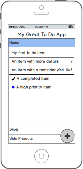
Here are four variations on a mobile to-do app:
Step 3: Iterate
The next step is to reach out and refine.
First, call in the other part of your brain, the less creative, more goal-driven part. You can put your PM hat back on. Let it help you refine and improve the ideas with potential. Add those few extra details that help make it tangible, such as the actual names of buttons or menu items.
Next, bring in a colleague or partner who knows the problem and/or the users. Explain your ideas (you should still have more than one at this point, ideally 3-5) and talk through the workflows with them. Let it be a cooperative process where you use your shared knowledge to imagine the end user using these screens. Capture any hiccups or missing pieces and fix them there or after you’ve gone through the whole thing together.
Step 4: Communicate
Wouldn’t it be great if we could just draw a product on the screen and push a button to make it real? Or if we had the skills to expertly conceive, design, create, and distribute software all by ourselves? If anyone claims to do all these things well, be wary.
In nearly all cases the next step will be to communicate your fleshed out idea to the person or team who will be building it (and possibly another team who will be marketing it).
If you work for a small company, the process may be similar to the previous step, where you walk the developers through your idea, step-by-step. Regardless, you’ll probably want to invest some time into making your solution idea easy to understand by people not intimately familiar with the users and their goals.
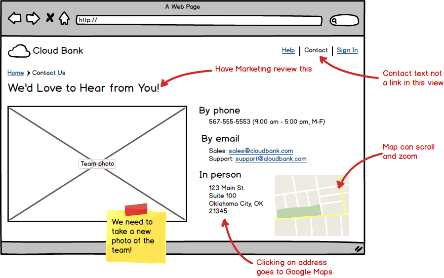
This can be done by adding notes and annotations to your wireframes to explain specific use cases and scenarios and by adding links between screens to demonstrate the intended workflow.

Step 5: Validate
Depending on your company’s approach to shipping, you may have several validation stages in your software process already, such as QA testing or even formal user testing. Use them here too.
The reason that you want to validate your wireframes is that you can catch potential problems early. Fixing problems during the design phase is much faster than fixing them during development.
Most critically, there are two key things to validate:
- Does this actually solve the problem my users are having?
- Can this be built?
The danger in “playing designer” is that you can adopt the habits that designers are negatively associated with, namely designing things for yourself rather than considering the full context.
So, make sure that you haven’t overlooked who you’re designing for and that you haven’t become too attached to your wireframes just because you created them! A feature that doesn’t solve a real problem can’t be fixed in a software update.
Second, ensure that you haven’t created an idealized vision that can’t be coded in the allotted time frame or with the current technology stack. Show your wireframes to the developers and do a reality check with them. If they push back, you may need to scale it back a bit in order to get the most important functionality in the hands of your customers sooner.
You can always add the remaining features later. The great thing is that you already have the design for them!
If you have the luxury of a user research or user experience team, you can have them test the usability of your design using informal/discount usability testing methods such as (digital) paper prototypes, 5-second tests, or hallway testing.
In short, the beauty of wireframes is that they can be easily understood by anyone, so don’t be shy about showing them to all the departments or teams that care about the product you’re designing. Show them that you recognize their role in the process. If nothing else, they’ll appreciate not being surprised when they see the real thing on their screen for the first time.
Summary
Wireframes are often misunderstood and underused in the software process. They occupy a grey area that can seem too artsy for business people and developers and not detailed enough for designers. Yet one of the main reasons why so many software solutions fail is the silo-ed nature of most tools and processes used by these roles. Tools that can bridge these gaps are desperately needed.
Wireframing is a technique that facilitates communication and knowledge transfer in order to help create better solutions and experiences for the end user. And by following a repeatable recipe for creating them, they are an easy and effective way for product managers to do what they do better.
The post Wireframes Aren’t Just for Designers appeared first on Mind the Product.
Source: Mind the Product https://www.mindtheproduct.com/wireframes-arent-just-for-designers/


Post a Comment